Occupy the City
Recently, it published the publication"Systems of Poster Series." This publication is about poster series for museums and cultural spaces. The goal of the publication is archiving and introducing exhibition poster series for museums internationally as many as possible - even though there are not so many of them - which are designed by a graphic designer or a graphic design studio for the specific period.
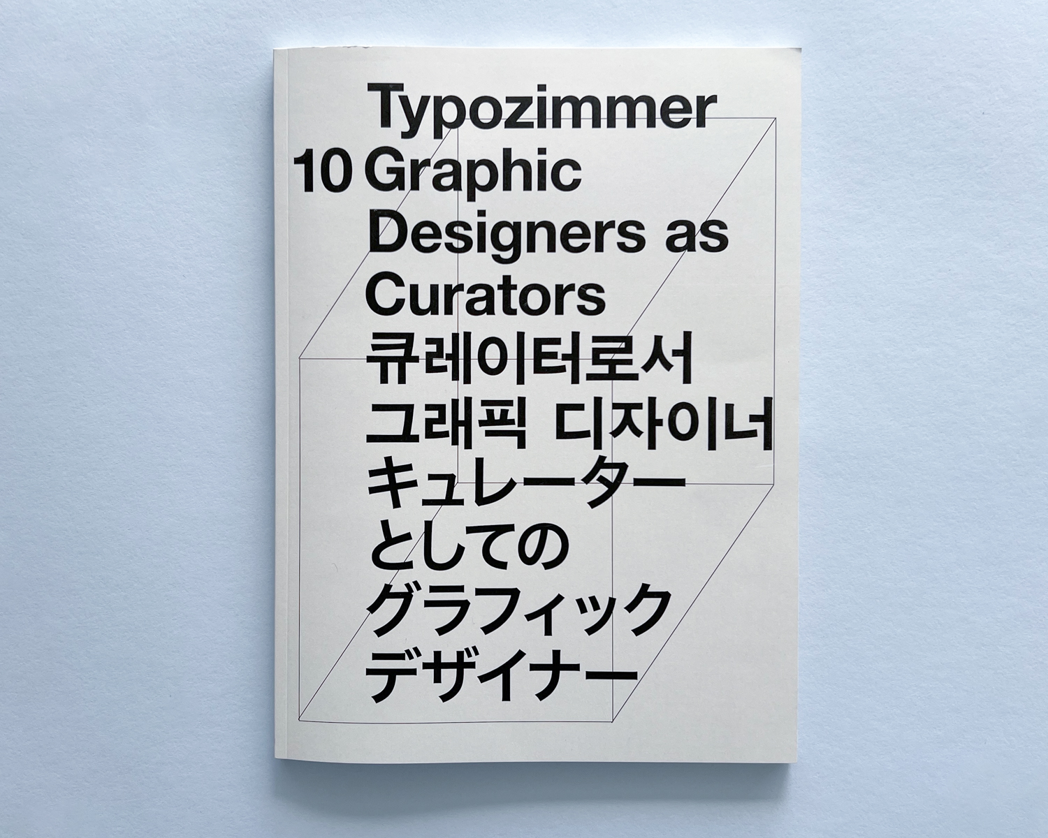
Issue Nr.10 of Typozimmer covers exhibitions curated by graphic designers since 2020. Rather than participating as artists of exhibitions, the designers curated, researched, and curated other artists, with the goal of reevaluating the relationship between graphic designers and exhibitions.
Additionally, the curators' perspectives on 100 Films 100 Posters, a meaningful exhibition of contemporary Korean graphic design. The focus was on how graphic designers, who curated the exhibition with different curators each year since 2020, prepared and organized for the exhibition.
The reason for setting the timeline as “since 2020” is due to the pandemic's impact, which significantly affected exhibitions held in physical spaces. Examining the survival strategies and alternative approaches to exhibitions adopted by designers unable to curate physical shows during this period is also considered meaningful.
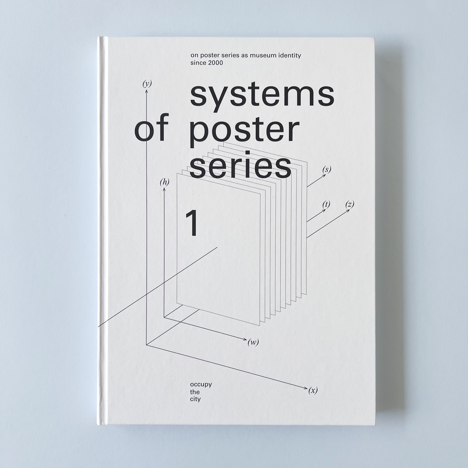
This publication is the result of a personal research project during 4 years since 2020 to 2023. It explores the poster series designed by graphic designers for museums since 2000. An exhibition poster series refers to a sequence of posters designed by the same designer for a specific museum, with variations created over a designated period. The duration and quantity of these poster series vary for each designer.
The research primarily focuses on exhibition poster series found in some museums across Europe, North America, and Asia. Additionally, the content delves into the design and work processes of nine designers/studios who have undertaken poster series projects in museums within these regions.
The designers interviewed provide insights into how they approached the design of their respective poster series. The publication includes a detailed examination of their creative processes, complemented by visual examples of their work. The following is a list of the designers featured in this exploration.
Swiss Architecture Museum - Claudiabasel(Jiri Oplatek)
Takeout Drawing - Jin & Park
Südpol - Felix Pfaffli
Black Cinema House(Image Building Object) - James Goggin
Print Gallery Tokyo - Hirofumi Abe
LIG Art Hall - Karl Nawrot
Asia Culture Center Art Theater - Sulki and Min
Kunsthalle Zürich - Dan Solbach
17717 - Mano An
These poster series were displayed both inside and outside the museum during the designated period, shaping the museum's identity and making it recognizable to the audience. Each designer's unique approach communicated with the audience, drawing attention to the place as a cohesive system.
To conclude, the publication presents an essay by architect Kang Hyunseok, providing insights into the graphic designer's exhibition poster series design process from an architectural perspective.
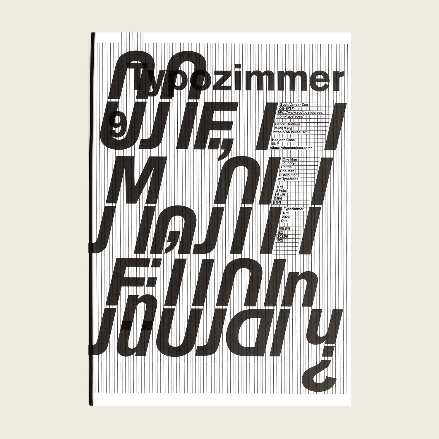
In this issue, it is the topic of individual type designers and their distribution methods for their own typefaces. As many publications have already covered the typographic aspects of individual type design for several years, its focus was primarily on the distribution aspect rather than the formal aspects of letterforms.
This issue has been in the works for a few years now, but with the increasing influence of IT platforms in this era, it has become challenging to find avenues for individual distribution. This has caused some delays in the planning process. Nonetheless, it is worth noting that not only in the realm of type design but also in almost every field, the influence of global platforms is growing as individuals strive to make their mark. Despite this, there are individuals who resist mainstream platforms and carve out their own niche, and this issue sheds light on their activities.
For each designer, their primary distribution channel is usually their personal website. Self-promotion is crucial in activating personal websites, and in this era, there is a diverse range of promotional channels available. Exploring each designer's typefaces on their personal websites can also be seen as an additional feature or bonus content.
In a production point, this issue is divided into two parts: "the Glyph section", where readers can randomly view each designer's letterforms, and "the Interview section", which focuses on discussions about distribution. The Interview section is bound in a more reader-friendly format, allowing for easy reading, while the Glyph section is left unbound to allow for a comfortable viewing experience of the letterform shapes.